

UX Research and Redesign | Composer PURE INVENTION MUSIC
My Role:
UX Audit, Content Audit, Information Architecture, Usability Testing, Prototyping, WordPress Development
Collaboration with: UI Designer, Wordpress Developer
Results:
-
30% increased conversion rate
-
Perceived brand professionalism increased from 3.2 to 4.5
-
Information findability increased from 2.9 to 4.4

Project Process

Project Background
PURE INVENTION MUSIC is a Toronto based company of composer and multi-instrumentalist. The client wanted the site to represent his work to attract new partnerships and potential customers and was feeling that the existing version wasn't effective enough. Also, the client was starting a musical project called "rome" and wanted to get more views and downloads for the first song of the project to move forward with it.
The main goals for the redesign:
-
To establish a professional brand through the site
-
To improve the findability of the composer's work
-
To find and fix possible usability challenges
-
To increase the conversion of song downloads and potential project partners contacts
Business constrains and specifics:
-
Music and songs are under the copywrite and can be listened to in full only when purchased from music platforms
-
Potential business partenrs rely a lot on recognised industry experience and memebership in professional associations
UX Audit and Usability Testing
I've analyzed the current User flow and conducted 4 user testings to find out what challenges users currently experience when using the site.
Main Findings:
-
All 3 pages had links to each other both in the main menu and at the bottom of each page but named differently - that created a false impression that each link would lead to the new information when in reality users were going in cycles and that made users very frustrated.
-
The first-page screen gave on the name of the composer without any additional information on why potential partners would be interested to know more and scroll/click around that led to a high bounce rate
-
The text on the About page was too long, hard to scan and with no clickable links to the work, memberships or IMBd page - so some users lost interest or had an impression that this composer hasn't done significant work yet
-
The Project page had a long text with only 1 Youtube video and iTunes link that made users confused about what was expected from them and why should they be interested in reading about it. Also, that led to missed opportunities in increasing number of downloads from other sources
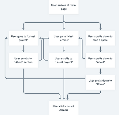
User Flow of initial site structure
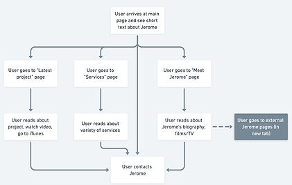
User Flow after Usability Testing
Content Audit and Recommendations
I've conducted the Content Audit to structure what content is currently on the site and what content needs to be added/changed to make the message more effective.

Part of the Content Audit table
Content recommendations:
-
Add information about the composer to the first screen to increase the user's motivation to explore the site or contact the composer
-
Make the content more personal and brand informative by adding composer's photos/background photos that are more representative of the work specifics
-
Edit site texts to show a story behind the composer's career and projects and make texts more readable and scannable by adding headings, shorten and dividing them into paragraphs with illustrative photos
-
Establish trust by making the composer's professional memberships and partnerships visible and interactive
-
Give users an opportunity to experience composer's work by adding music samples
-
Attract more interest form potential clients and create an additional page "Services" with descriptions for all Services as well as testimonials from previous clients
Prototyping and User testing
To show how my recommendations could look like and test them with users I created a new User flow and interactive prototypes:

Prototypes version 1 - Home page, About page and new Services page
Main findings:
-
Users enjoyed the idea of being able to listen to the samples of the songs
-
Users felt more trust in the composer's professionalism through the visible membership and links
-
Users felt that the flow is more clear and information is easier to find
-
Some users would like to see more individual information on the Home page
-
Some users would like more background on the song samples to know if they are interested (like a genre, film etc.)
Design decisions
Most of the ideas were implemented step by step as soon as new content was collected, so the site was changing little by little over 2 months. That gave me the opportunity to track any changes in the users' behaviour using analytics data for the small site changes and try out different ideas.
Some of the ideas for the redesign were decided to put on hold and some of them evolved after looking at the screencasts of users' behaviour. For example:
-
The Services page was decided to be put on hold until further research of the potential customers there was the hypothesis that they are already in the music business and don't require an additional explanation about the services
-
Testimonials needed some time to be collected so this was postponed as well
-
Soundtracks samples would need to include more background information like a photo of the film, name and mood of the music
-
Some of the text for the Project page was made optional to read under the headings "About the song", "About the Video" and "Credits" for those users who would like to learn more about the song
Redesign results
I've implemented final designs on the Wordpress site so the client can continue to edit texts or add new information if needed in the future.
-
30% increased conversion rate
-
Perceived brand professionalism increased from 3.2 to 4.5
-
Information findability increased from 2.9 to 4.4

Part of the Home page (before)

Part of the Home page (after)

Part of the About page (before)

Part of the Project page (before)

Part of the About page (after)
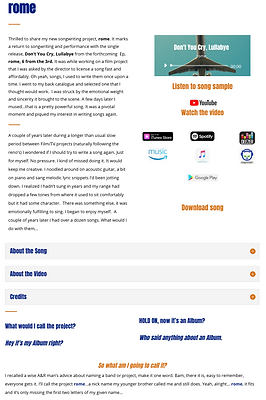
Part of the Project page (after)
Client's testimonial
Elena Glebkovskaya inherited my half started then abandoned Website. She performed miracles redesigning it with creative flair and clarity yet kept it user friendly with informative links,graphics, samples and buttons. Elena is also very open to trying different ideas. Very professional and approachable.
Jerome McPeek,
Music Composer for Film, Television and Media
PURE INVENTION MUSIC
TITLE OF THE CALLOUT BLOCK
Lessons learned and next steps
-
The importance of researching the specifics of the business to find out what clients usually expect from the professional sites, the terminology they use and how much details are needed when presenting the services on the site.
Next step: more user interviews with the users from the musical field
-
The importance of making sure the content that is needed is approved and can be collected before including it in the Prototypes to make the process more time effective and have an opportunity to test it with the users on the prototype stage.
Next step: Including the new content that is still in the collecting stage and testing it with the users
-
The importance of finding out the long-term business plans that would impact the site's contents and maybe structure and create the Content Strategy.
Next step: Creating the Content Strategy that would include pages for the other songs of the "rome" project as well as Service pages.