


Project Process

Project Background
As a study UX project I needed to look closer at the TTC (Toronto Transit Commission) — the public transport agency that operates bus, subway, streetcar, and paratransit services in Toronto, Canada. As a newcomer in Canada, I didn’t have much experience with it or any strong opinions at all — so I was excited to look at TTC from a user's perspective and find out how people in Toronto feel about it.
Discovery Research
As I had no starting hypothesis at this point and a very broad vision of potential users (all TTC passengers) — I decided to start with Secondary Research for any TTC reviews and comments I could find. One thing stood out for me instantly — TTC riders have lots of emotions about TTC. I could find discussions about it on Twitter, Reddit, Facebook, Yelp, Quora and other forums:

Some of the online comments
The stories people are telling are different — some are angry, some frustrated, some are grateful and happy. I made a long list of possible problems, to name a few:
-
Transport delays
-
Drivers unfriendliness
-
Complex payment system
-
Boredom when commuting
-
Loneliness while commuting
-
Difficulty to stay fit (not walking enough)
To find the core problem for these pain points I've interviewed 15 commuters who were unhappy with TTC in any way using the “5 Why?” tool. My goal was to try and find a core problem.
Main findings
Many people are eager to give TTC and want TTC to get better. But they are not always sure how to do it.
A lack of direct and structured communication between commuters and TTC might be one of the core problems.
My hypothesis
People want to be able to let TTC know about the good and bad experiences that they have, but don’t have a proper way to do it, and that causes frustration.
To test my hypothesis I've set the following Research objectives:
What motivates people to give company feedback?
What do they expect from this interaction?
What company reaction they receive in reality?
I talked to 5 people on the TTC stations asked them about their great or bad experiences with TTC, if they’ve ever given feedback to TTC and how and why they did it, and what they expected back.
Some findings:
-
People wanted to feel valued and heard by TTC and have an impact on TTC processes and changes.
-
People usually want to blow off steam and have a way to express emotions (especially negative) directly to TTC without creating a negative atmosphere in public social media

Research question
How might we help users communicate directly with TTC in a simple and effective way?
Jobs To Be Done and Personas
As a result of these sidewalk conversations, I formulated several Jobs To Be Done:
“When I feel bad about TTC I want to tell them, so I can get rid of this emotion and feel better”
“When I experience something bad in TTC I want to let them know so they make future experience better”
“When I like the driver in TTC I want them to impact TTC so they can recognize him”
I’ve also started to see my potential users more clear to create Personas that would guide my process:

Ideation and Sketching
The only direct way for giving feedback to TTC was an official TCC complain form. There were also lots of indirect competitors that currently help users to do their JTBD: Twitter, Yelp, Reddit, TripAdvisor, Facebook, Quora etc. They all have great features that make the feedback process easier and faster. I’ve looked at some of the competitors as well as other effective Apps and sites to rate experience, searching for the ideas that might be a starting point for my App.

Some of the features that I liked:
-
Visual rating (stars, cycles)
-
Opportunity to leave comments
-
Placeholder question helping to formulate a comment
-
Opportunity to add a photo
-
Location tracking
-
Personal human communication
To generate a wide variety of solutions and create an innovative one I used a Crazy 8 technique for brainstorming — I sketched 8 screen ideas in 8 minutes. I chose the solution that I thought would represent all them and sketched 3 main screens to start.

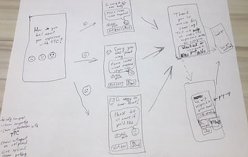
Design Decisions and Prototype v. 1
A friendly face

I wanted my App to be easy to use and friendly, associated with the connection and open dialogue. Many users complained that they didn’t get a response from TTC when they posted feedback on social media, so I wanted to give them a feeling of interaction and direct communication. To create this feeling of personal connection and trust I designed a TTC character based on their logo but with a face, that would smile or be sad depending on the feedback received.
Easy route location

To make the interaction with an App as easy as possible I added a first step that would offer possible route numbers where a user may currently be and offer an option to type the route number manually or skip it completely.
Clear rating system for all cultures

The next step would be to rate TTC experience. I’ve analyzed the rating systems that are currently being used in Apps like 5 stars, colourful cycles, 1 to 10 number scale, words like “Bad” and “Good” and thumbs up/thumbs down etc. My inspiration was a simple system in Casa Btllo Museum in Barcelona with it’s a simple and clear smiley faces rating system. As I observed tourists from lots of countries using it I saw that it is quite intuitive. So I’ve decided to go with a clear rating system — 3 smiley faces combined with words (Awful, Just Ok and Perfect). I was hoping that by adding smiley faces and words I made the rating choice fast and easy for people in Toronto with different cultural backgrounds as well as tourists from all over the world.
A feeling of an interaction

I also decided to design screens for giving feedback to resemble messengers (as if users were chatting with TTC character) and I wrote screen texts that would not look official, but more emotional and open to conversation. My logo TTC character changed facial expression depending on negative or positive feedback people were giving and offered users to tell more details and add a photo if they wanted to. I hoped that would encourage people to be open and feel the value of their feedback.
Two-way communication

The last step was to ensure the possibility of two-way communication — users could leave their email if they want to be contacted by TTC.
Option to change your mind

After first couple of user testings of a low-fidelity prototype I found out that sometimes users want to change their rating when they start writing a comment (they start to feel they’ve been too harsh, for example) — so I’ve added an option to change the smiley rating by clicking on it as users do on Facebook.
User testing findings
I have tested the Prototype version 1 with 6 people and here are some of the insights I got from them:
Confusing buttons
-
Button “Skip” that I thought would provide people with free choice to skip things they don’t want to do just caused confusion
-
Button “Share” that I’ve named so meaning “sharing my feedback” made people nervous as they suspected this would share their feedback in some social media
Flow barriers
-
Users expected the App to know their route number with GPS and only if that was not accurate — to put the number themselves
-
After choosing the rating smiley face users were expecting to go directly to the next screen, and the need to tap additional button was frustrating
-
Some users couldn’t relate to words under smiley faces and found them too emotional or extreme
Additional features
-
Some users didn’t want to type comments — they wanted to choose from several options that they rate (like “driver”, “service delay” etc.) or different adjectives describing the experience.
-
Users were wondering how they will remember to rate if they are planning to use App on a regular basis
-
Users would like to have offline access so they can also rate subway and ratings automatically uploaded when online
-
Some users would like to have a Profile that will remember their ratings and comments and motivate them to rate more. Some want also to see ratings of their friends
Prioritizing new features
On the basis of the user testing findings, I’ve come up with some ideas on how to change my Prototype and rated all the ideas according to Impact/ Effort Matrix to decide which of them to implement in my next Prototype:

The ideas that seemed to me will be High Impact/Low Effort quadrant I’ve implemented in the Prototype version 2 for user testing.
The ideas in Low Impact/Low Effort quadrant — I wasn’t quite sure about the impact, so I decided to implement them as well and test in both version 1 and version 2 to understand if that really matters (for user testing and potentially A/B testing).
The ideas in Low Impact/High Effort quadrant are things for future research — as their potential implementation would take a lot of time and cost I wanted to investigate if they would bring benefit to people (for ethnography research, observations and user interviews).
The ideas from High Impact/High Effort quadrant require implementing a lot of back end functionality and may be implemented for testing in future iterations and then if they are in the final product — need to be continuously tested with existing users to ensure their value (for user testings, dairy studies, user flow analytics).
The ideas from High Impact/Low Effort quadrant I’ve implemented in the Prototype version 2 for the next user testing.
New features in Prototype v.2
Here are some of the changes implemented in Prototype version 2:

Learnings and Reflection Questions
Is this function really needed?
When I had this App idea at first I wanted to include as many functions as possible into it — like an option to call directly to TTC call center. But after talking to users I understood that the only situations they would like to call would be some crucial ones when it is actually better to call emergency 911. Also having a call button would increase the risk of accidentally pressing it and that would frustrate and annoy users.
Do these icons and words have the needed message in all cultures?
More research needed to find out if smiley faces have optimal clear emotions and words are relatable, as well as possible alterations in colour (should they be different colours and what meaning can these colours have for people from different cultures?), should they be placed from Bad on the left to Great on the right on the other way round?
Will this solution be accessible for all and who are we excluding?
The users that I had in mind were mostly 20–40 years old and used to using apps. Then I began thinking of other users that may not like/want using an app and how they can have the same opportunity to express their opinion. So the addition to this App idea might be placing interactive screens into all TTC vehicles that will have the same option of rating and typing feedback (optional). Both for an App and interactive screen research should include people with disabilities to make it accessible and maybe create other alternatives to give feedback.
What benefit would it bring to the company and what cost it will have?
For this case study, I didn’t have any constraints from a business perspective as it is just an idea. But in real life, this would be one of the first questions I think about — what cost will have, what departments and business process will it impact? In my case study creating the App is the easiest part — but it will be useless without a huge amount of effort from TTC side:
-
Hiring people to react to feedback and analyze it
-
Coming up with solutions and implementing a process to put chosen solutions into action, involving Service Designers
-
Tracking all the feedback and creating regular reports
-
Motivating people to continue giving feedback (discounts/badges/free rides etc.)
Overall this was a great experience of finding a problem, creating quick solutions involving users on all stages — that proved how important it is to include User Research in all stages of the development process.